Painting with Gaussians
Last year I built an edge-aware pixelation tool to turn images into pixel art by deforming a grid so that it follows image edges instead of naively using a fixed grid over the picture. Using an edge adapter grid bent to inform the color and brightness of the pixels worked well for keeping edges crisp and preserving details.
I later realized the same edge information could also be applied in a context of digital painting. A painting program has to figure out where to put brush strokes, how big should they be, and which direction should they flow in. Much of that is already encoded in the edges since they mark the boundaries between regions. These are the contours around areas of objects that a brush would trace, and their absence indicates generally flat areas where a few broad strokes should suffice.
And so, I set off to see if I could make a program that paints in the style of a digital painting where marks derived from the image structure would resemble brush strokes. My goal was to make an interactive tool where you drag sliders around and the painting reforms itself in front of you. The project was also a great opportunity for me to test drive Jolt and see how well it works for building a non-trivial project.
In this post, I'll walk you through how it all came together. We'll see what ideas worked and which ones didn't. Most importantly, we'll find out whether the end result actually ends up resembling anything like a painting.
The first question we need to consider is what a brush stroke is exactly in computational terms. A stroke of oil or acrylic is an elongated mark which has a center of color that fades toward its edges, and its orientation is the product of a brush being dragged across a canvas. It's translucent at the edges, and strokes overlap, allowing a painter to lay down broad blocks of color first, then build detail on top with smaller and more translucent marks to add finer detail.
It turns out that a 2D Gaussian splat maps onto this idea surprisingly well. It has a mean which is where the stroke lands, a covariance matrix representing how it's stretched and rotated, along with a color and opacity. The covariance can be used to encode the brush direction and its elongation with the major axis pointing along the stroke, and the minor axis across it. Rendering a field of splats with standard over-compositing where each one is occluding what's behind it by its alpha gives you a similar effect to a natural painting model that allows marks to layer and blend together. Of course, you don't get the same fidelity of actual paint, so the effect is closer to digital painting using a tool like GIMP or Krita.
There are already some implementations of this idea such as DrawingWithGaussians and 2d-gaussian-splatting-Art. However, both of them use a gradient descent approach where they seed random splats, and then iteratively nudge their positions, shapes, and colors until the rendered field has the appearance of a target image. That's the well known approach which is both slow and opaque. The worst part is that the end result ends up being simply a lossy reconstruction of the input image rather than looking like any sort of a painting.
Since I already had the solution for extracting edge information from the image, I didn't see the point of evolving the image blindly. Instead, the extracted edges can be used to guide the painting process because they tell us where the details are along with the orientation of the strokes. Between detail density and pixel colors I had all the information that I'd need without having to resort to gradient descent. I'd basically just need to trace the existing image. How hard could it be really?
So, I started following the reference rasterizer which uses additive blending where: pixel = background + Σ(intensity × color). Turns out, this approach works in the fitting regime because the optimizer learns colors that compensate for overlap. Unfortunately, seeding thousands of splats directly from pixel colors and rendering them additively creates a lot more overlap. With 1,200 splats on a 64×64 image, the sum hit 22.06 in some pixels, creating pure white blobs all over the image. Luckily, the problem can be solved by using the standard over-operator from alpha compositing to make each splat occlude what's behind it by its alpha so that the summed color never exceeds 1.0. Another benefit of this approach is that it cleanly separates color sampled from the image and opacity.
Edges Tell You Where to Paint
Every image in this section is the same photo run through the same pipeline, with one idea switched off at a time — same source, same stroke budget, same base size — so each step shows exactly what that one idea buys.
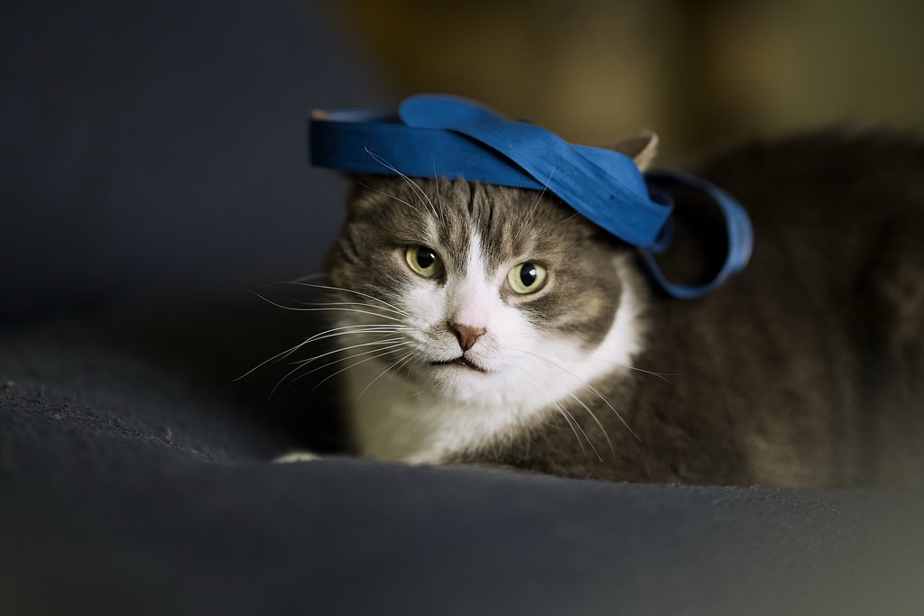
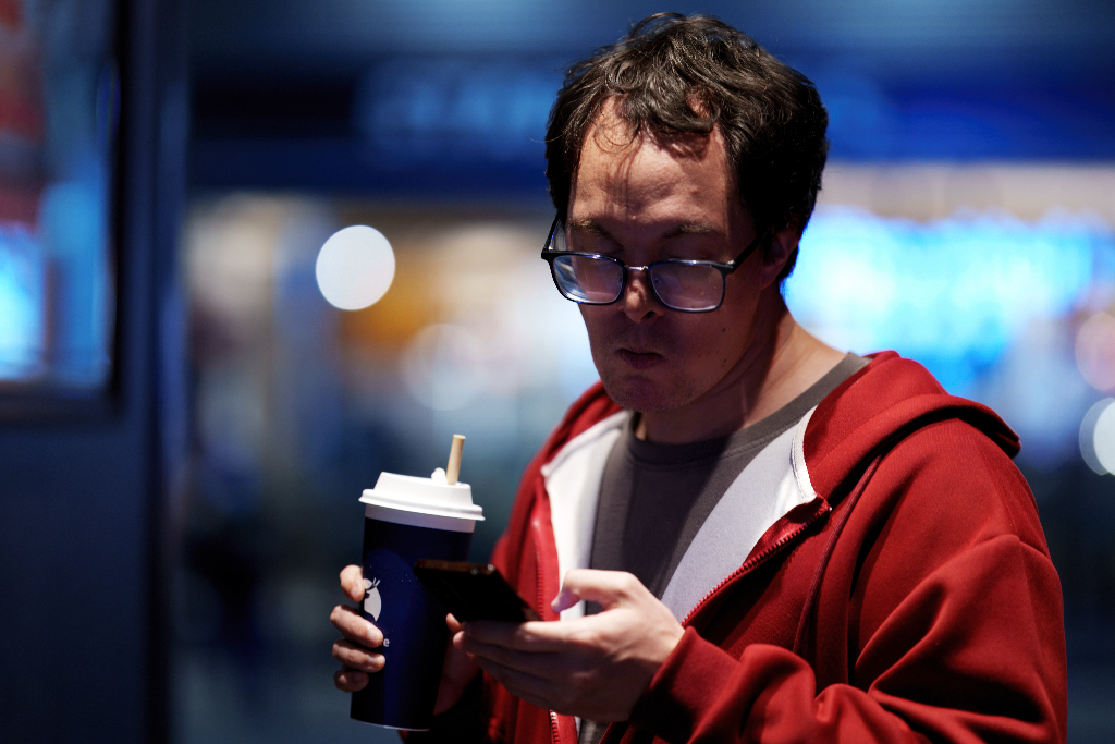
I started using the following source photo, and recorded the progress as I continued to improve the app to illustrate what each idea buys. Let's see how the painting evolves as new tricks are added to the mix.
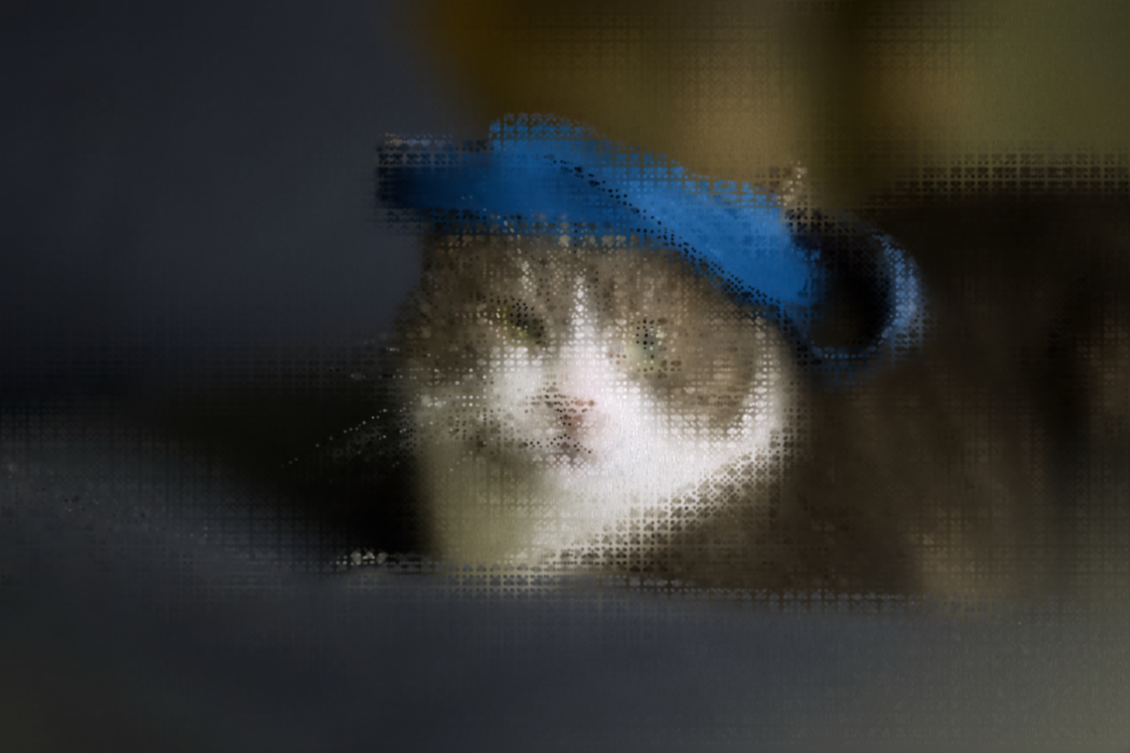
I got a rather sad output which looked like a uniform mosaic with my initial renderer. Every splat had the same size, aspect ratio, and rotation, producing a regular grid of identical blobs. Not really looking like much of a painting so far.
An actual painter would vary their strokes using a few broad strokes for flat regions such as the sky or a smooth surface. Then, along edges and in textured areas like eyes or fabric, a smaller brush gets used to make numerous finer strokes that follow the contours of the objects.
One way to emulate this is by using a structure tensor to compute the image gradient, encoding how much and in which direction the color changes for each pixel. A 2×2 tensor is formed from the gradient outer product, and blurred over a neighborhood. Importantly, the tensor's eigenvectors will tell you three key things. The major eigenvector points across the contour, providing the direction of the strongest gradient. The minor eigenvector points along the edge, giving the direction of the brush stroke. And coherence, which is the ratio of eigenvalues, tells you whether the edge is a crisp contour or isotropic mush.
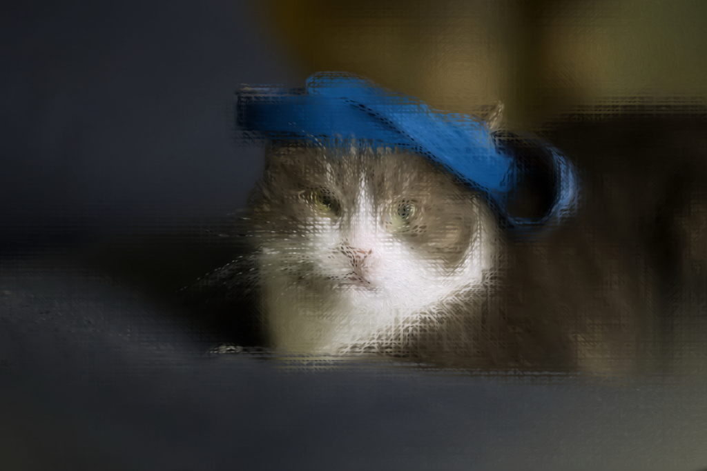
Each splat gets its own covariance from this tensor at its position, and gets elongated along the edge, with elongation being proportional to coherence. Flat areas stay round while the edges become thin, directional strokes that trace the contours of the objects in the scene. This is the classic painterly rendering trick from Litwinowicz and Hertzmann. With it in place, the rendering started to resemble something that looks like brushwork if you squint a bit. Here, the fur and the hat brim pick up direction, and the whiskers start to appear.
But here, I hit another problem because the structure tensor uses luminance gradients which are grayscale, making it blind to isoluminant color edges such as red lips against pale skin or a blue sign on a grey wall. Luckily, the Di Zenzo color tensor can be used to compute Sobel gradients per RGB channel. Their outer products can then be summed into one tensor, giving a chroma edge that drives orientation as strongly as a luma edge.
Edges Aren't Enough
While the structure tensor solves the problem of figuring out orientation, it tells you nothing about the density of the region. And without knowing that, it's not possible to figure out how many strokes need to go in that region and how small should they be.
You might be thinking that you could just use edge strength to figure this out, and decide on the number of strokes to use based on that. But doing so ends up missing the texture of the objects entirely. For example, a gravel path has little coherent edge structure but lots of high-frequency detail that deserves its own fine marks. A smooth cheek, on the other hand, has a single contour edge while its interior should stay broad. Conversely, a faint-but-real edge, such as subtle fabric folds or distant tree branches, has low absolute gradient magnitude but still needs to be rendered. So, relying solely on doing edge analysis makes it impossible to reproduce many of the important details present in the original image.
This is where the Haar wavelet, which I discussed in this post, comes into play. Running a multi-scale 2D Haar decomposition on the luminance produces a detail energy map by summing the absolute detail coefficients across scales for each cell. The map will contain high values in textured and edgy regions, and low values in ones lacking detail. But raw wavelet energy still has the problem of being absolute. A dark region with genuine texture produces less absolute energy than a bright region with moderate texture, leading to the dark details getting washed out.
What we need here, again, is a luma-relative detail map where each cell's energy is divided by its local mean brightness plus a fraction of the global mean. Now, dark regions can keep their detail, and since the map is fused with locally-normalized edge strength from the structure tensor, a faint contour in a flat region will still attract strokes.
And that's why both of these techniques are valuable here. The tensor carries the orientation and coherence for every stroke, while the wavelet identifies the density map needed to drive adaptive placement. Together they form a complete answer to the question of where detail lives and what shape it has. At this point, things are starting to come together, and there is enough information extracted from the source image to go beyond naive algorithmic stroke placement.
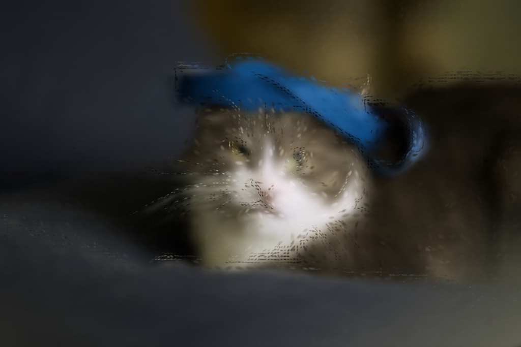
The detail map now decides where the small marks are spent, and the out-of-focus background turns into a smooth wash, while the strokes collect on areas of detail such as the fur and the eyes.
Killing the Grid
However, there's still one remaining problem that we haven't talked about yet. Even with adaptive orientation and density, the output still ends up looking off because the strokes end up having a faint regularity to them. Their placement and regular shape are an artifact of having a regular placement grid.
Using a stratified grid where you divide the image into cells and put one stroke in each of them will necessarily create artifacts at the edges. Incidentally, this is the same problem seen in JPEG compression at higher levels. It's possible to jitter the position within the cell to break the lattice or use rotated grids per detail level, but these workarounds don't address the underlying problem of the grid being regular.
And so, the grid approach needs to be abandoned in favor of placing strokes at positions derived from a Wang avalanche hash of their index. This method gives true white-noise coordinates with no periodicity. There's a subtlety here, however, because a simple linear hash (frac × i A) produces points that fall on Marsaglia hyperplanes leading to diagonal stripes which are even worse than the grid artifacts. You need a proper avalanche mix where each input bit affects every output bit.
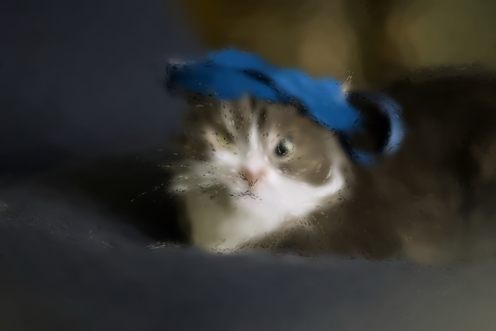
Making It Look Painted: Noise as a Feature
At this point I had edge-aligned strokes at adaptive densities which smoothly paint across the whole canvas, but the result still felt too regular. Every stroke on a given edge had the same length, the same spacing, the same alignment, which is not what real brushwork looks like. I needed some way to emulate the hand wavering and changes in pressure to make the painted effect more plausible.
And what better way to add subtle structural variation than to use Perlin noise. I recently wrote a post showing how it can be used to create a flow animation. So, I naturally reached for it since it was fresh in my mind. Two decorrelated 2D Perlin channels can be used to form a smooth vector flow field. Then, each stroke's orientation can be derived by blending the structure tensor's edge angle with the Perlin flow angle, weighted by (1 − coherence). The stroke follows the contour faithfully on a strong edge with coherence approaching 1, while it has a more organic flow field in a flat region with coherence around 0. Using this trick makes the background look a bit like flowing brushwork thanks to the turbulence introduced by the noise factor.
The flow field is computed from a heavily-blurred copy of the structure tensor to diffuse edge orientations into surrounding flat areas. A stroke in a low-detail region follows the nearby feature since the flow of a distant contour ripples through the background. In areas where there aren't any features to guide the strokes, the Perlin vector field takes over to produce organic curves without a directional bias. Per-stroke size and color also need to have independent noise channels to avoid strokes looking identical even in uniform regions. This is the first version where the marks started actually resembling brushwork.
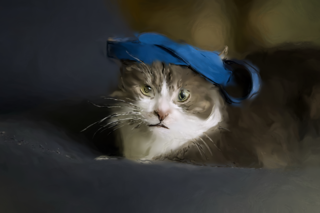
Of course, that all sounds good on paper, but in practice I started seeing a regular wavy pattern in the images. Digging into it, I discovered that the Perlin bend is a shared spatial field, so neighboring strokes end up creating a wave in phase, with every chain passing through a region getting an identical bend sequence. The result ends up looking like a coherent fabric-like weave. And it's particularly noticeable near moderate edges such as fingers or cloth folds. To get a bit of natural variation there would need to be a per-seed phase offset in the noise coords to make each stroke wobble independently.
Layering: How a Painter Builds a Canvas
With all the core pieces in place, the next step was to try doing the actual painting. My idea was to emulate a physical painting process where large splats can be used to define general color regions, and then to layer progressively smaller splats to add progressive detail on top. This way the painting would start with a broad underpainting; mid-tones would be added next, then glazes, and fine detail on top. Each layer is more translucent and specific than the one below it, augmenting the existing structure that's already been built up.
The base layer contains large, opaque strokes that fully cover the image, ensuring that there are no gaps that would create empty spaces. Next is the subject-adaptive broad tier derived from the wavelet detail map, which points to where the interesting content is. In the background where subjectness is low, strokes grow larger and sparser to create a bokeh effect, melting into a few soft daubs. Under the subject where detail is high, the strokes have to stay tight to capture the important features in the image. The mid tier isn't fundamentally different from the base layer, containing shorter and more translucent strokes representing glazes which bring out general shapes in the image. So, the overall mechanic here stays largely the same.
The fine tier is where the real brush strokes live. At this resolution single dabs are not sufficient, and each fine seed needs to trace a chain of tapered Gaussian segments stepped along the edge tangent, so they all fuse into a continuous line. Low-frequency Perlin noise is used to bend the chain slightly. Size and alpha taper toward the tail like a brush lifting. Colors need to be sampled from one side of the edge so the two sides' paints meet at the boundary instead of crossing it. On strong edges, fine strokes carry nearly opaque paint, emulating impasto liner strokes that sit on top of the glaze. The edge map is also used to inform the length of detail strokes, each following an unbroken segment without any breaks or sharp corners in it. Thus, the strokes have a lot of variance in terms of length and shape, the way a real paintbrush would.
Since each refinement level is more translucent, the details accumulate on the underpainting rather than scratching over it. One thing that becomes tricky at finer details, however, is ensuring that strokes hitting a color boundary fade toward the tail as they drift from their original color. When the mismatch becomes large enough, the chain needs to stop before emitting, which simulates the painter lifting the brush at the region boundary.
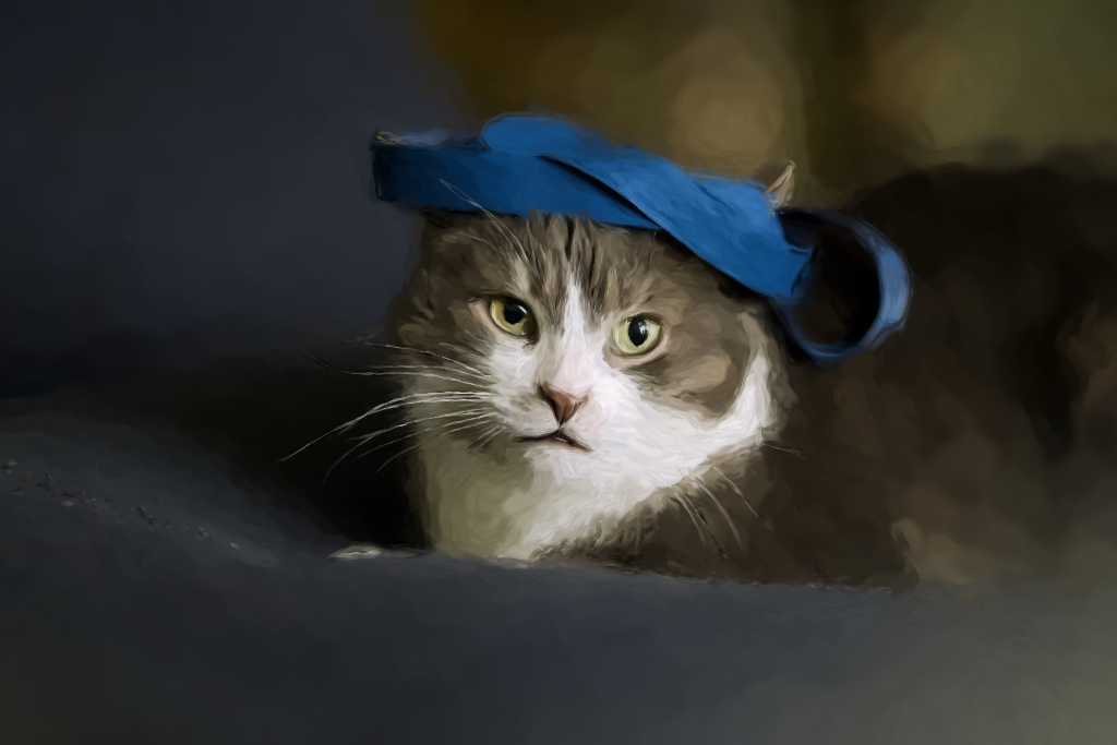
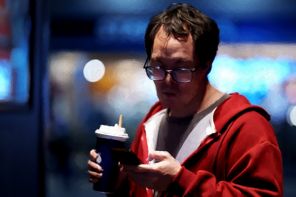
Here you can finally see the full pipeline with the same strokes as the previous image, but now built up in layers which become progressively more translucent and more color-specific at the top, along with an edge tier that restates the silhouettes from their own sides. You can judge for yourself whether the end result looks painted, but it seems pretty good to my eye.
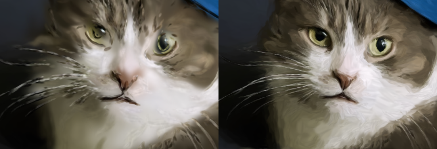
The same crop before (left) and after (right) shows how the whiskers hold their color instead of smearing into the fur, and the eyes sit crisply against their surroundings.
The GPU Move
I started with the CPU pipeline, which ran at 55–112ms per render, and that was fine for a few tens of thousands of splats. It was also valuable as it led to a couple of performance optimizations seen in pull requests here and here. So, that ended up being a useful exercise for tuning the compiler, but a detailed painting would need hundreds of thousands of small strokes and no amount of tuning would help there. Every splat being a Clojure allocation means that the whole vector would have to cross to the GPU each frame.
At this point, the only viable solution was to move generation entirely to the GPU and do the work within an OpenGL context. Conveniently, the approach I was already following maps well to doing transform feedback with a geometry shader, feeding it a vertex program of candidate points. The shader, in turn, threshold-tests each against the detail map, runs the placement math, and emits packed splat records for the survivors. The buffer stays on the GPU, allowing the render pass to be done directly.
Doing heavy math on the GPU made the whole thing fast enough to tweak different parameters interactively. Controlling the number of splats being used, how small the splats can get, their hardness, and smoothing across different resolutions allows tailoring the end effect for each image being rendered. Most of these controls loosely map to physical painting concepts such as brush size, paint load, glaze transparency, stroke length, and hand steadiness. All that naturally fell out of the approach to model the problem as a painting exercise.
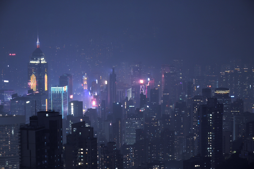
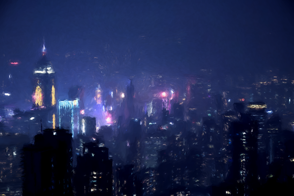
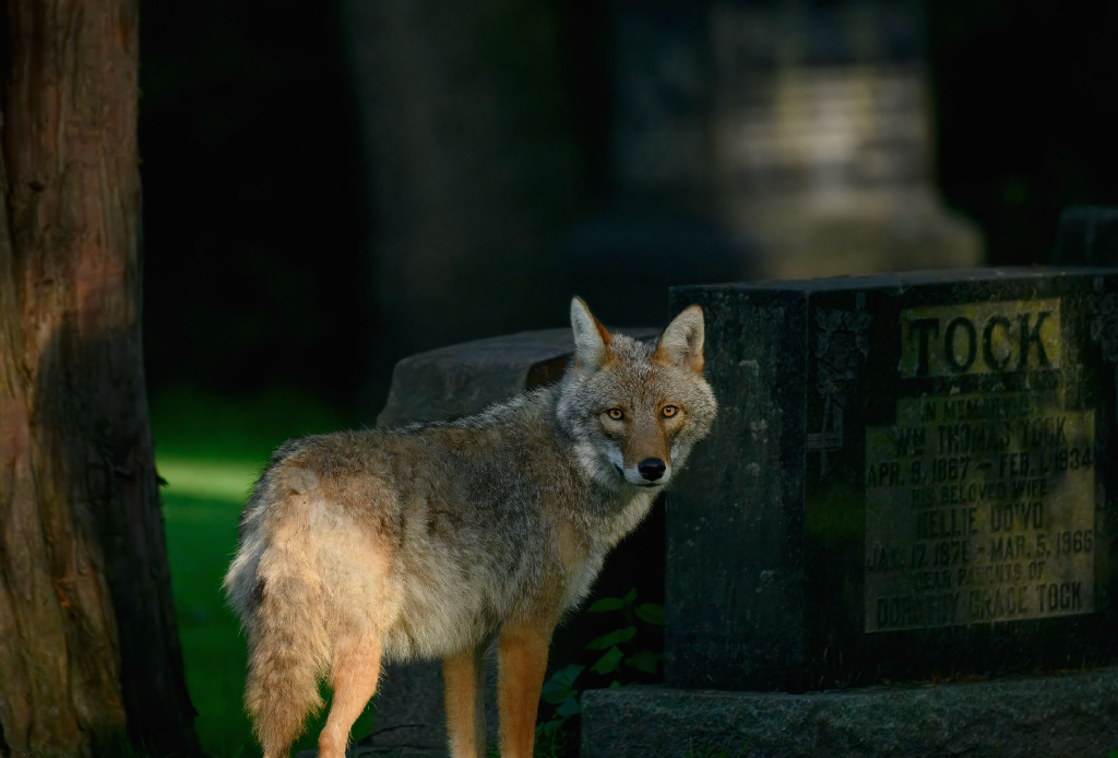
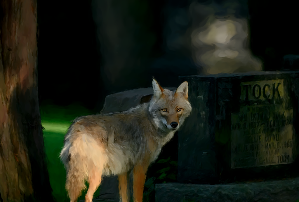
And a few more examples illustrating how the painter works with different kinds of scenes and settings:
Conclusion
In the days of generative image models, it's still fun to see what can be achieved using traditional image transformation techniques. Building a desktop app to prove the concept turned out to be a great exercise for Jolt and my Glimmer reactive GUI library on top of GTK. The exercise also shook out a lack of type hinting optimizations in Jolt, leading to general performance improvements, and helped prove out the nREPL-driven development workflow.
In the end, I'd call the experiment a success. While it could still be tuned further to produce even more realistic painting effects, the general concept works as well as I dared hope. Turns out that analyzing edges and textures of an image to extract its structure gives a lot of the same information a painter uses to decide where to put brush strokes. In that sense, the algorithm really is doing digital painting.
But the really fun part of the project was in combining a number of techniques, such as Perlin noise, wavelets, and edge detection, that I played around with previously in isolation. All these different tricks came together for this project, making it possible to build something greater than the sum of its parts. I find these are the most rewarding types of experiments where you can build on things you've previously learned and combine them in novel ways to make something new and unexpected. I hope you enjoyed the journey as much as I did working on the project.
As always, the project is open source, and can be found on GitHub.